
Your website is going to serve as the base of your marketing efforts.
It’s where people will either find your product or get information about it.
It will either persuade them to sign up or bounce.
Just to be clear, the actual Propfire application is custom built, primarily in PHP and lives at the subdomain app.propfire.com. Propfire.com is my marketing website.
Anatomy of a Website
There are really 3 parts to a marketing website:
- Content
- Messaging
- Design
All three of these elements are important for the success of a website, but some are much more difficult to get right than others.
The first thing to do is look at other, similar, saas websites for inspiration.
There’s absolutely no reason to reinvent the wheel, when hundreds of companies have already done the A/B testing for you. Yes, it’s ok to copy design, structure and even messaging — unless you’ve got the same exact product and are copying word for word (that’s not cool).
Your goal is not to win awards for the most innovative, cutting edge design.
Your goal is to explain your product and persuade potential users to try it.
Design and Messaging
The design of your homepage and the messaging you convey, particularly above the fold, is clearly the most important factor in grabbing the attention of potential users.
Here’s a rundown of my process:
After recording the video you might have just watched (above), I got inspired and decided to record a quick start video. I switched the “Learn More” button to “Watch Video” and made it trigger on hover over.
The reason I did hover instead of click thru was purely technical. The WordPress theme I’m using did not have the built in capability to launch a popup with the video when clicking on the button. So I used a tool called tooltip.io, which lets you add different kinds of popups and slide-ins on top of any website elements. The problem with this is that the button has 2 elements, the actual button and the button label (watch video), and the tool only lets you choose one element as a trigger, which means that you would have to click on either the label or the area surrounding it — and that would cause confusion if you didn’t click on the right one. So I chose hover, even though it might be annoying if you unintentionally happen to hover over the button.
I used Loom to create, host and track the screencast (video). It’s a free tool that launches right from a chrome extension and makes screencasts super easy to record.
Content
Content includes … well, all the content on the site and how it is organized.
What are the links on the main nav? These will be your guide to structuring the content on your website.
In my opinion the less nav items the better.
You don’t want to overwhelm or distract users. You do want them to quickly and easily find the exact info they’re looking for.
Depending on the complexity of your product, you might need more or less information. If your product has a lot of technical specs and integrations, then you might want to add a nav item for developers.
For Propfire, I decided to start with as few nav items as possible, and then add more in the future, if necessary.

The “Features” tab takes you a bit further down the home page, where I list the apps features. You’d assume the user would make it down that far on their own when viewing the homepage … but “assuming” doesn’t always work out so well, especially with the super short attention spans most of us have.
A direct link to “features” also catches the user’s eye, especially if that’s exactly what they’re looking for.
The next link is “Demo”, which contains a couple of short demo videos of how to use the product. I initially had a 25 minute video taking the user from registration through proposal completion — something comparable to a recorded webinar. But when I began making some major updates to the product, the video became obsolete and I haven’t yet decided whether to record a new video, for 2 reasons:
- People don’t usually like viewing looong videos.
- I don’t know if new users need to watch every step of the process of using the product. The highlights are good enough to get them started.
While I’m not going to post a full length, start to finish, video, I am planning to post more demos of specific features. (I literally just decided to do that as I was writing this — which proves to me that writing these posts is a really helpful exercise!)
The rest of my nav items are pretty standard — and I made sure to highlight the “try it free” free trial signup link. BTW, I chose “Try it Free” over Free Trial based on how Pipedrive does it on their site.
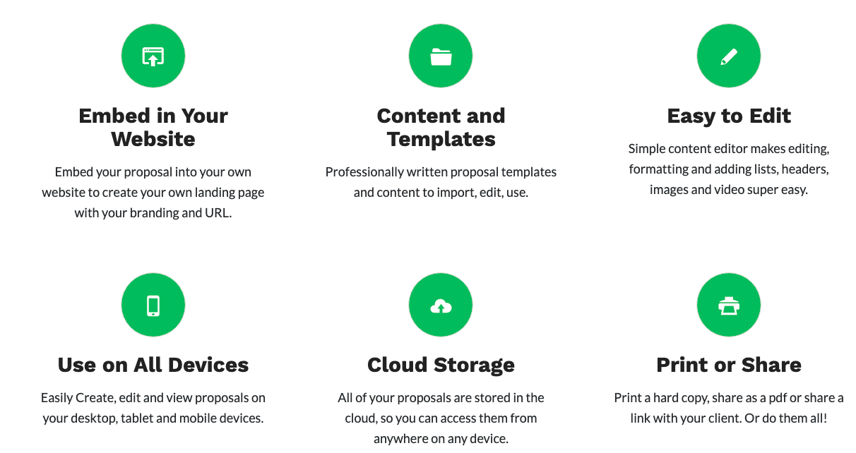
Highlighting Features
You don’t want to list every single feature of your product on your homepage (I’d least I don’t), so you need to choose the top ones that you feel will make a difference in persuading users to try it.
Some, or even most, of your features will be ones that your competitors also have. In fact, you probably need those features in order to compete with them.
I chose 6 features (to keep the design uniform, 3×3) of which 5 are industry standard. The main feature that stand out are the ability to embed your proposal into your own website, and I put that feature first. In general, Propfire is just easier and quicker to use — but that’s not a feature.
Social Proof
The next section we chose to put on our site, right after features, is a testimonial from one of our early adopters.

I don’t have to reiterate the importance of social proof. A testimonial gives you some automatic credibility and it gives your (potential) user some comfort to know that someone else like himself is using your product.
Qualify Users
It’s a great feeling when you get that notification when a new user has signed up for your product. But if it’s someone who isn’t your target user and isn’t going to end up using the product, it’s just false hope and a waste of time and resources.
With Propfire we have a no credit card required free trial, so there isn’t any barrier stopping those irrelevant tire kickers.
So what I decided to do is at least try to qualify prospects by telling them whether Propfire is right for them or not.

I’ve tried to make is as clear as simple to read as possible — why you should or should not try Propfire.
I hope this helps potential users decide whether to try Propfire or whether it really isn’t what they are looking for.
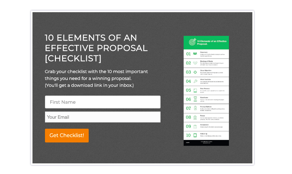
[ Help your users make their decision ]Lead Magnet
I wouldn’t be much of a content marketer if I didn’t have a lead magnet on my site. It just requires a first name and email address, and then an email with the download link is sent via Mailchimp. The CTA is towards the bottom of the page as well as in a modal (on scroll down) and exit popup.
Conclusion
I tried to lay out the process I went through to build the Propfire marketing site — but I think the most important think to take away from this is that it’s all a work in process. I’m still going to make changes to the website as a I come up with new ideas and get feedback from users.
That’s the beauty of digital – you can constantly update and modify.